Mr. Fontastic
For a guy who is not a designer, I sure am obsessed with fonts. I have been since the late eighties, when a designer I worked with at Scholastic enjoyed pointing out how much choosing the right typeface could immediately alter or enhance an article I was preparing for publication.
I go font shopping from time to time to help me nail the look of a particular project Denise and I are working on on the side.
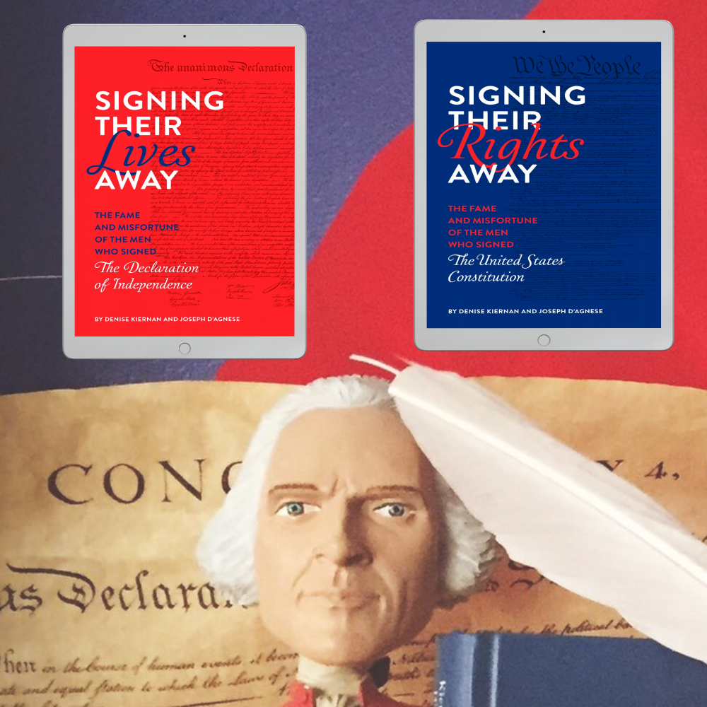
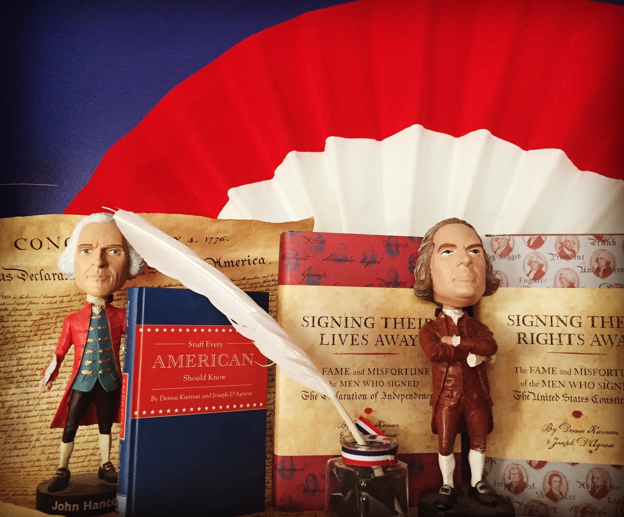
My go-to websites are myfonts and Fontspring, but I have been known to buy direct, which is how I came across the work of Brian Willson, a typeface designer and novelist who is renowned in this field, particularly for designing fonts that resemble the handwriting of real people from history. You can buy his fonts at all the usual suspects, but I like to patronize him directly at his two websites, OldFonts and 3IP Type Foundry.

A lovely example of the American Scribe font…
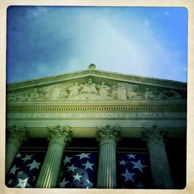
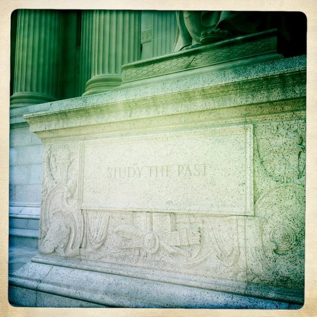
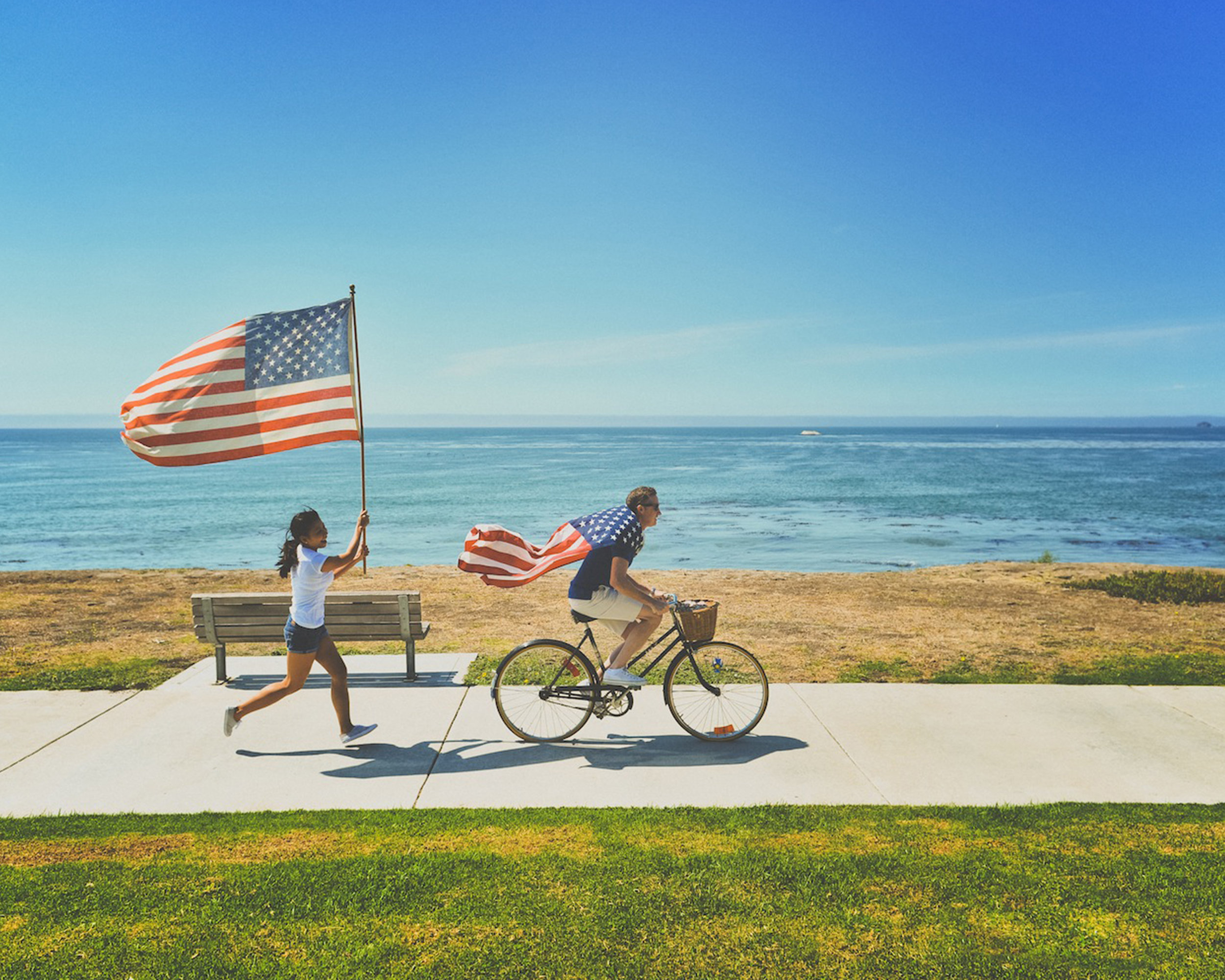
Since 4th of July is around the corner, I thought I’d talk to him about his “American Scribe” font, which takes its inspiration from the handwriting of Timothy Matlack, the man who hand-wrote the “engrossed” copy of the Declaration of Independence during the summer of 1776. This is the actual document that all the sitting members of Congress signed, most famously John Hancock. The original document resides in the rotunda of the National Archives building in Washington, DC.
In a few weeks, I’ll share another article on handwriting, the Declaration, and Mr. Willson’s work in my usual monthly slot at SleuthSayers, the mystery blog.
That article will feature excerpts from my talk with Mr. Willson. Here is the full interview, for the record.
***

Brian Willson
How many years have you been a typeface designer?
Thirty-two years. I designed my first font on something of a lark back in 1993, just to see if I could do it. “Marydale” replicates the personable hand-lettering of the art director of a trade magazine company I was working for who suppled me with various letterforms on a couple sheets of poster board. I made Regular and Bold weights using Altsys Fontographer (an early bezier curve application) and released the Regular as shareware on CompuServe and AOL, noting that if users sent me a check for $10, I’d send them the Bold weight. (The improved version of the “Marydale” font now also has a heavy Black weight.) Started getting checks, which was incentive enough to keep making fonts.
How long does it typically take to create all the full character set? Are you working on software that makes the characters as big as your head?
It takes a while to make a full-featured typeface. Early versions of my fonts probably took no longer than a couple or three months, but later versions (and newer fonts) – with extended character sets and fancy OpenType features – typically take four to six months to polish off. It’s pretty tedious work.
I first used Fontographer, then Font Lab’s inaugural release, then versions of Font Lab Studio, and most recently FontLab 8.
When creating a particular glyph, I start by tracing enlarged versions of selected characters scanned from actual letters (or other source material) on the screen of a MacBook Pro (so not quite as large as my head) using vector graphics software (typically Adobe Illustrator and/or Photoshop)–including every bump and/or hiccup.

Sample of American Scribe font
How did you come to design “American Scribe”? What attracted you to the Declaration of Independence?
By 2003, after already designing a few historical pen fonts (mostly modeled after the handwriting on letters of notable Texans from the days of the Republic), it occurred to me that replicating the famous Declaration of Independence script might prove popular, so...
How did you find a copy of the Declaration that offered good enough resolution to replicate? What did you do then? Can you give me an idea how the creation of a font happens? What is the process?
I tracked down an old, scaled-down copy of the Declaration of Independence (on replica parchment) I’d acquired as a kid and figured I’d start with that.
The process goes like this:
• Pore over the old scripts, looking for the most typical and legible letters of the upper- and lowercase alphabets, along with numerals, punctuation marks, etc.
• Scan each of these glyphs and bring the saved digital scans into a program with vector graphics tools (usually Adobe Photoshop), then begin tracing.
• Export the traced outlines as PostScript files that can be imported into a font design application (Fontographer or FontLab), where each glyph can be tweaked, perfected, and (in the case of cursive scripts) made to seamlessly connect with every other.
Do you agree that Matlack had lovely penmanship? Were there idiosyncrasies in his style that you began to notice as you worked with his text?
Matlack did indeed have lovely, legible penmanship. Whereas I don’t recall thinking things like, “Oh, he must’ve dipped his pen here,” it always gives me pause to see the occasional ink blot or inserted word (as “only” inserted by Jefferson in the Declaration) or cross-out or underscore in some of these old documents.
Did you feel like you got inside his head at all? In other words, does some sense of his personality leap out at you as you were working?
Yes, in all the old pen fonts I’ve designed, I feel like I’m somehow “inside the head” of the writer whose script I’m replicating. You can seemingly get a feel for the emotions based on pen pressure (or lack thereof) and the like. There’s something extra there, too – as when you recognize the handwriting of a beloved family member in the address on an envelope you might receive in the mail (or used to receive, as handwritten letters aren’t anywhere near as common as they used to be).
His ascenders and descenders are so lush and beautiful. Were they fun to work with?
Yes!
Do you as a designer ever hear from the people who buy one of your fonts, and learn how they used it? Is “American Scribe” sought out because of its connection to the Declaration, with the Revolution, with 1776? Or do some designers use it for projects that have nothing to do with the Colonial period at all?
I do, yes. Often. It’s one of the finest rewards of this work. And, yes, some folks likely wish to give the feel of the Revolution in their use of American Scribe, but others simply like the look of the font and their use is entirely unrelated (as when it appears on wine labels, say).
One fun font you did—“Oak Street”—was inspired by a server’s scrawl in a modern-day diner. What challenge does a font have to present to attract you?
A great question not easy to answer.
A few source scripts just held a first-blush allure–some quality that made them handsome and/or distinct to my eyes. For instance, the penmanship of Mirabeau B. Lamar, second President of Texas, struck me as particularly elegant (although–quite unlike Sam Houston, famous first President of the Republic–Lamar was not a friend of indigenous Texans). Same with “Schooner Script,” inspired by a pastor’s hand on an old letter I found in an antique shop nearby, which held distinctive flourishes.
[Note from Joe: “Lamar Pen” was used by the producers of the film Harry Potter and the Half-Blood Prince, in a quick transition shot to display the handwriting of the “prince” himself, Severus Snape.]
Other fonts came from handwritten material that filled what I saw as a hole in my library, e.g., “Emily Austin” was my first font based on the hand of a woman from history. (“Abigail Adams” is another.) Among the modern hands, “Professor” (modeled after my father’s handwriting), filled the slot of the kind of legible modern cursive we used to be taught in school. And “Viktorie” ended my search for a messy-looking handwriting sample.
Finally, I designed a few handwritten fonts after receiving over-the-transom suggestions: “Douglass Pen” (suggested by actor Arthur Burghardt, who performed a one-man show as noted abolitionist, orator, and statesman Frederick Douglas); “Military Scribe” (suggested by a historical reenactor and based on the muster rolls of the Tenth of Foot, a British military unit that fought in the American Revolution); “Bonhomme Richard” (suggested by a U.S. Navy Chief interested in getting a tattoo of a quote of John Paul Jones).
The font you refer to—“Oak Street,” which came from the hand-written menus of a favorite restaurant (on Oak Street)-–is a member of a collection of six modern hands I made early on. (A few are fairly popular, but the old hands comprise my “niche.”)
Are you working on a new font at the moment?
I might have one more font in me: a serif typeface inspired by an old property deed from the early 19th century. We shall see.
I’ll close by adding that you might enjoy reading Mr. Willson’s novel, Lydia, about a typeface designer who buys a reportedly haunted house in Maine, which sounds a lot like the real-life adventures of our author…
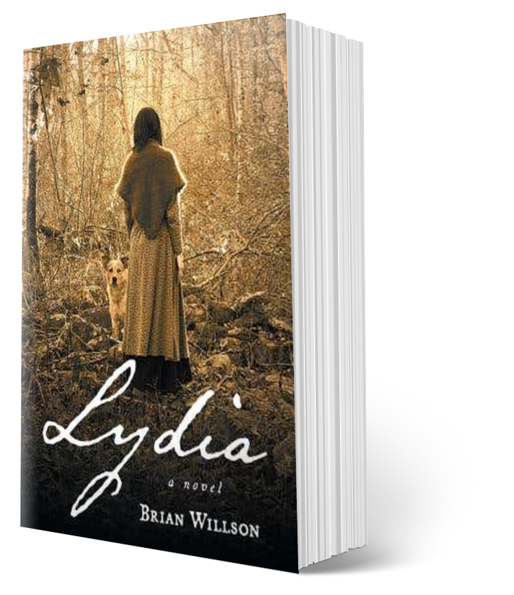
Click to learn more about the book. (Affiliate link)
Image of the National Archives copyright Joseph D’Agnese